|
section
two
chapter
three
planning a comicbook cover
ideas
and approaches
A
few years ago I told Dennis Eichhorn I wanted to do a cover
for his autobiographical comic, Real Stuff (Fantagraphics
Books). He put me off. All the past cover artists had been
a Who´s Who of the best-known alternative cartoonists, including
Peter Bagge, Jaime Hernandez, and Charles Burns. I just
wasn't famous enough. Yet I knew I could do a cover that
held up to the others, maybe because I wasn't famous.
Real Stuff was a regular venue for me whereas a more
famous cartoonist might have felt like he was slumming by
doing a cover and not have put as much into it.
|
Art
by (left to right) Paul Bryan, J.R. Williams,
and Toani Rytohonka. |
fig
1
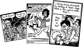
A
few panels from various stories in Real
Stuff #17, sent to me by Dennis Eichhorn.
Although it was pretty much a throwaway story
in the magazine, Strange Dreams, in
which a greaser repeatedly chokes Boy Denny
into oblivion, seemed perfect fodder for a
punchy cover.
|
|
Eichhorn eventually asked me to do a cover. It would be issue
number 17, and a few of the stories were already drawn. Denny
sent me copies (fig 1). The
stories were late in Real Stuff's run, and Eichhorn
was a supporting character in most of them. Yet, the essence
of Real Stuff for me was Eichhorn´s life and the things
that had happened to him. I wanted to feature him. In the
pile of copies there was a little story about how Denny lifts
weights as a form of revenge because he got softened-up by
a bunch of greasers on the playlot when he was a kid. I had
drawn Denny at nearly every age, but never as kid. None of
the other issues had a cover depicting Eichhorn in childhood,
so I knew this would make my cover different.
|
|
fig
2
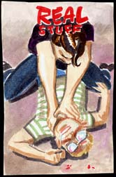
I
gave away all my color roughs for this cover,
so I can only show the final sketch I settled
on.
In my Real Stuff work I always drew Eichhorn
without eyes, using the big bubbly reflections
in his glasses to denote expressions and almost
to depict him as a cartoon icon like Little
Orphan Annie. I would count on those reflections
in his glasses to make it clear that the kid
getting strangled was Denny.
|
|
I
started sketching
color roughs. An interview I read with Jim Woodring gave me
inspiration. Jim is a dedicated artist who values discipline.
He also appreciates craftsmanship and the idea of stretching
to make an ambitious drawing, as opposed to the usual "alternative
cartoonist" notion that art should be whatever comes easily
or hits you in the moment. He articulated these values in
the interview, as he does by example again and again in his
own work. I did three color roughs and settled on the one
I knew would really push me but where the extra ambition would
pay off in extra impact (fig 2). Tricky drawing that
doesn't serve the story is just self-indulgent. Norman Rockwell
was one of the great cover artists of all time. Not only was
his stuff cartoonish, but he managed to tell entire stories
in a single image, and with maximum impact. Everything in
his painting served the storytelling. A good comic cover does
the same thing. If you think back to Carl Barks or all those
great old Superman covers they have a lot in common
with Rockwell's Saturday Evening Post covers goofy
but clever stories told with a single punchy image.
I wanted a Rockwell-like design for this cover, but with anti-Rockwellian
subject matter. I chose a birdseye angle because it emphasized
Eichhorn´s helplessness and created a voyeuristic effect.
It's a tough angle. I´d have to use tracing paper to get it
right.
initial
drawing
|
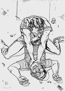
fig
3
The
first version of the cover penciled out onto
tracing paper.
I resisted the strong temptation to photograph
this situation and project it with a lucigraph.
That would be a crass use of technology.
Some adjustments were yet to come to keep the
figures from looking as squashed as they do
here. I knew from the start that this drawing
would be difficult, but I also knew that if
it turned out well it would be something I really
liked.
|
|
|
I've heard
stories from people who'd seen Jack Kirby draw. He was incredibly
fast, and by all accounts the image seemed to pour from the
tip of his pencil. He told people that he saw the drawing
fully formed in his mind's eye before setting pencil to paper,
so in effect he was replaying, or "tracing," a mentally-complete
image.
I have to use tracing paper. In the case of an important
image, like a big magazine illustration or a comic cover,
I´ll work the drawing out piece by piece on tracing paper.
I'm just not good enough to draw straight on the board.
In this case I drew the greaser first. Then I overlaid another
piece of tracing paper and drew Eichhorn. I had made his
torso too short, so I shoved that piece of tracing paper
down, taped the two pieces together, and traced them both
onto a third large piece. As I trace, I move the image I'm
tracing to adjust proportions and to position everything
exactly where I want it. In the end, I wind up with a final
penciled piece of art on tracing paper (fig 3).
Next, I transfer that image onto my illustration board.
 |
|
Suggested
Drill: Don't Just Sit There
When
I find myself spacing out in front
of the TV, I grab my sketchbook.
By quickly sketching thumbnails
of the shot compositions on the
screen, I solve future layout problems
and develop my design skills.
Cartoonists have the huge burden
of drawing from imagination all
the time. These TV sketches add
a lot of depth to future panels
by adding elements
shadows, fixtures, framing
that you could never just `make
up.´ It's especially difficult to
show two people talking for panel
after panel. Movies deal with this
problem all the time.
The Ford and Welles type pictures
with moody, lingering shots (so
you have time to draw them) are
best. So put down that beer and
pick up that pencil!
|
|
|
|
I flip the tracing paper over and trace the image on the reverse
side using a soft pencil. During this process I have the luxury
of working on a mirror image of my art. If you ever want a
cold look at all the flaws in your drawing, hold it up to
a mirror. The mirror image reveals wonkiness and asymmetry
that you don't see when you view the picture the "right" way.
This is because (in my unscientific view) there are biases
in how we render things that we accept too readily because
we're used to seeing them and don't question how true they
are. While I trace on the reverse side of the tracing paper,
I see these flaws and fix them as I trace.
I then center the page on a piece of illustration board, tape
it down, and retrace the front once again. This transfers
a light impression of the graphite from the reverse of the
tracing paper onto the board. I clean this up and repencil
it one more time for my final pencil art, which I then ink
with my Winsor Newton Series 7 #3 brush and ancient bottle
of Higgins Black Magic which I've left open for a while to
evaporate the fluid out and make it thicker and darker.
next
page: finishing the cover
|