|
|
|||||||||||||||||||||||||||||
|
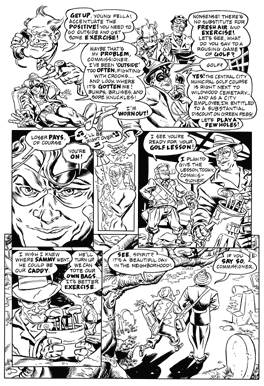
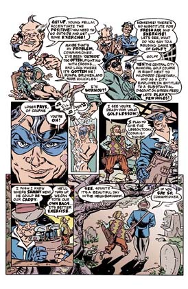
chapter two drawing a page of The Spirit: The New Adventures 7 putting the pictures on the page I
prep all the final art boards at the same time. I make a stack of
Strathmore 500 series five ply smooth board cut to 12.5" x 18,"
and I rule an image size of 10" x 15" on each. I use a template
to notch blue panel gutters, so I'll know where to subdivide my
tiers. Then I prepare to pencil. I pencil the entire story, then
ink the entire story after all pages are penciled. Then I apply
all the whiteout, then all the color. This is fastest for me, and
leads to the most consistency.
The Spirit was my first time penciling in blue instead of regular graphite. The advantage of graphite is it erases more easily if you need to revise the drawing. Graphite also looks more similar to the printed black image. The advantages of blue are more numerous. Erasing obliterates ink along with pencil. Because cameras don't perceive pale blue, you don't have to erase after you ink over blue. Blue line also leads to fleshier inks. You have more of a feeling of actually "drawing" in ink, since there is no black image. Since you instinctively adjust a page for darkness, black pencil gives you the impression that a page is already darker so as a result you tend to ink lighter. Then you erase the pencils to find your page is too pale ("Bruce Berry Syndrome"). Since blue lines mean the first black you lay down is ink, you tend to improvise the black more and lay it on thicker. I've tried every kind of blue pencil and I swear by the Staedtler Non-Photo Blue 108-30. It's the only kind that is erasable (with an electric eraser), draws on non-toothy paper (I use "smooth" finish), and doesn't repel india ink. It costs three times as much as the other brands. Someone at Staedtler figured out how to cash in on the rich comic book artists. I asked my friend Rick Altergott to letter this story because he has nice Wally Wood-style lettering that suits the Spirit perfectly. He did a beautiful job. The lettering takes place after the pencils but before the inks. I ink with a Windsor-Newton Series 7 #3. I notice they now make a stubbier version to preserve the sable population. I tried one and it was awful. Lately I've been fiddling with a reloadable Kaimei brush pen and I'm thinking about using it to ink except the blue pencil seems to repel the cartridge ink. Ink is tricky. They just don't make it black anymore in this age of environmental vogue. I guess real india ink is too "toxic." Some kid must have gone and drank a bunch and croaked, ruining it for everybody else. I still use old bottles of Higgins Black Magic, but my supply is running out. People tell me Dr. Martin makes a good black ink, but I tried it and it, too, seemed anemic to me.
|
|
|
|||||
|
|